Color shapes the way you experience each room, influencing mood, energy, and the overall feel of the space throughout the day. Applying color psychology is not about following trends but about selecting colors that serve a purpose. With the right approach, you can create the best home color schemes that bring balance and character to every space.
This guide explores how to use color strategically, with practical examples and insight into how each choice shapes the home’s atmosphere.
Use Warm Neutrals to Build a Calm Foundation
Warm neutrals such as soft taupe, cream, and muted sand create a balanced foundation that complements most design styles. These tones work particularly well in living rooms and bedrooms where you want a relaxed, understated feel. In Houston homes, where natural light is abundant, warm neutrals maintain a consistent atmosphere throughout the day without shifting dramatically in different lighting conditions.
These shades also serve as a backdrop for bolder accent colors or layered textures. When used on walls or large furniture pieces, warm neutrals support a cohesive look that connects adjoining rooms. Their subtlety allows the rest of the décor to shine, reinforcing harmony without overwhelming the senses.
Introduce Blues for Serenity and Balance
Blue remains one of the most popular colors due to its association with calm and steadiness. Light blues can create a peaceful environment perfect for bedrooms, reading corners, or bathrooms. Deeper navy tones bring sophistication and work well in dining rooms or offices where a grounded, focused atmosphere is desired.
Blues can stand on their own or pair effortlessly with whites, wood tones, and brushed metal finishes. Their versatility makes them ideal for cultivating the best home color schemes that feel timeless. By using blue intentionally, you can establish balance and stability throughout the home without sacrificing personality.
Add Greens to Encourage Refreshment and Ease
Green evokes a sense of renewal and connection to nature, making it an excellent choice for areas where you want clarity and comfort. Soft sage or eucalyptus tones help kitchens and bedrooms feel fresh and composed. Richer greens, such as olive or forest, can add depth to offices, dining rooms, or entryways. These hues work exceptionally well in Houston homes where greenery and outdoor spaces are integral to the local lifestyle.
Green also pairs well with natural textures, such as wood, rattan, or stone, reinforcing a grounded design. Its psychological effect supports mental ease and quiet focus, making it ideal for multitasking spaces. Incorporating green tones helps bridge the gap between indoor and outdoor environments, creating a seamless flow between the two.
Use Yellows to Brighten and Energize Your Space
Yellow tones introduce energy and warmth, making them perfect for kitchens, breakfast nooks, or creative areas. Soft buttery yellows bring gentle brightness, while deeper golden tones add richness and warmth. In homes with limited natural light, yellow can help counterbalance shadows and create a cheerful atmosphere that feels inviting throughout the day.
When incorporating yellow, consider grounding it with neutral furniture or natural materials. This helps maintain balance and prevents the room from feeling overstimulated. Because yellow often symbolizes optimism and clarity, it works well in areas where people gather or spend time, especially at the start of their day.
Embrace Soft Pinks for Comfort and Subtle Warmth
Pinks, especially muted blush or rose tones, create a cozy and approachable environment. These shades add warmth without overpowering the room, making them suitable for guest rooms, living areas, or primary bedrooms. In Houston homes featuring contemporary design elements, pinks help soften sharp lines and add an inviting, lived-in feel.
These hues pair beautifully with gray, cream, and natural wood tones, allowing for a wide range of design styles. Pink’s association with calmness and openness makes it a suitable choice for spaces designed for relaxation or thoughtful conversations. Its subtle energy supports a space that feels both polished and welcoming.
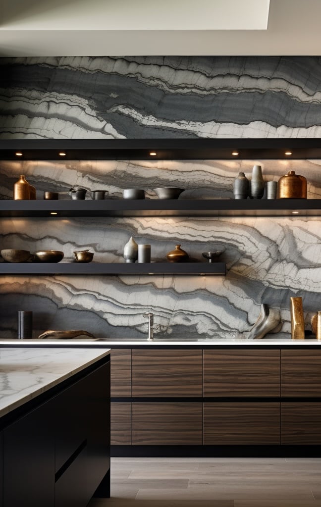
Use Grays and Charcoal for Structure and Modern Style
Gray remains a go-to color for modern interiors due to its clean, structured feel. Light grays offer versatility and work well as whole-home colors that blend seamlessly with a wide range of décor. Darker charcoal tones create drama and sophistication, ideal for accent walls, offices, or media rooms where you want a more intimate environment.
In Houston’s newer builds, gray often supports open-concept layouts by giving each area a visual anchor. Grays also make an excellent pairing base for more expressive color choices. Their adaptability supports thoughtful color psychology in home design, giving you the freedom to customize around a strong neutral framework.
Highlight Accent Colors to Shape Mood and Focus
Accent colors help define personality without overwhelming the room. A single accent wall, a painted ceiling, or a bold piece of furniture can instantly shift the tone. Deep teal, warm terracotta, or mustard can energize a room, while soft lavender or misty blue creates calm pockets. For Houston homes with open floor plans, using accent colors strategically helps identify different zones while maintaining cohesion.
Accents also work well in transitional areas such as hallways or entryways, giving guests an inviting first impression. These touches allow you to test bold ideas without committing to an entire room. Accent colors support the best home color schemes by emphasizing depth, rhythm, and visual interest.
Use Color to Improve Flow Between Rooms
Color psychology becomes especially valuable when you want your home to feel connected. Selecting a coordinated palette across multiple spaces helps create a sense of continuity. This approach does not require every room to share identical colors; instead, choose tones that complement each other through shade, temperature, or finish.
In Houston homes with open layouts, shared color palettes help structure the space without the need for physical dividers. This strategy also lets your décor feel intentional and grounded. By ensuring colors relate to each other, you establish a sense of unity that enhances the home’s overall comfort and style.
Brighten Your New Home with TXRE Group
Thoughtful color choices give your home purpose, clarity, and personality. By applying color psychology in home design, you can build rooms that feel balanced, energetic, or serene depending on your goals. For expert guidance on selecting the best home color schemes or preparing your property for the market, TXRE Group is ready to help you transform your home with confidence and style.